Third Space
- Context:
- Commercial
- Date:
- Client:
- Third Space
- Launch:
An Experiment in Urban Hospitality
Third Space is an experiment in urban hospitality; a community-creating, non-profit cafe in Dublin’s inner city.
The Client
Third Space are a non-profit organization founded with the goal of creating community neighborhood spaces where people can gather regularly, easily, informally and inexpensively.
Historically, beyond the home and the workplace, the traditional community-forming spaces in Irish towns and cities were the GAA (sports) club, the church and the pub. In modern Irish cities, which grew rapidly with economic growth in recent decades, these community-forming spaces had not been considered. This was leading to a very fractured urban community in cities such as Dublin.
I was initially hired to created a visual identity for the project, but my role soon expanded to incorporate strategic consulting for the entire project.
In partnership with Santos & Santos.
The link to postmarks and places conjures up feelings of good times, shared experiences and ‘wish you were here’. Experiencing something that you had to tell someone so they could enjoy it too.
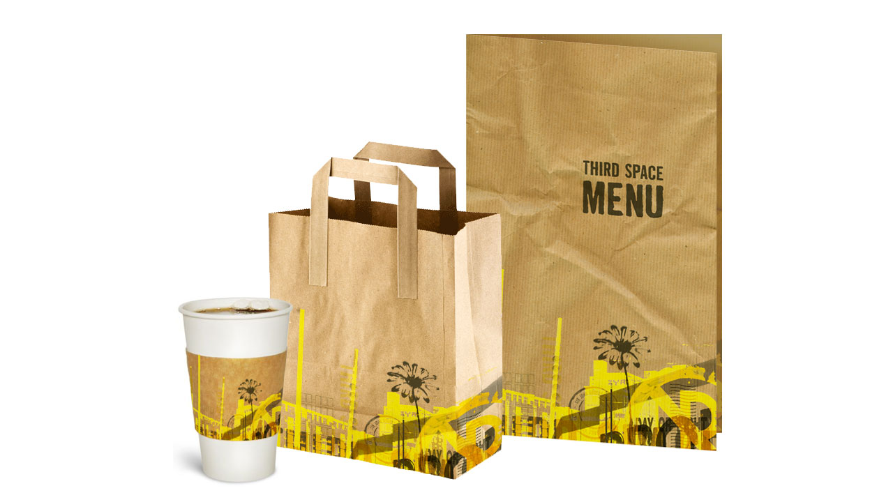
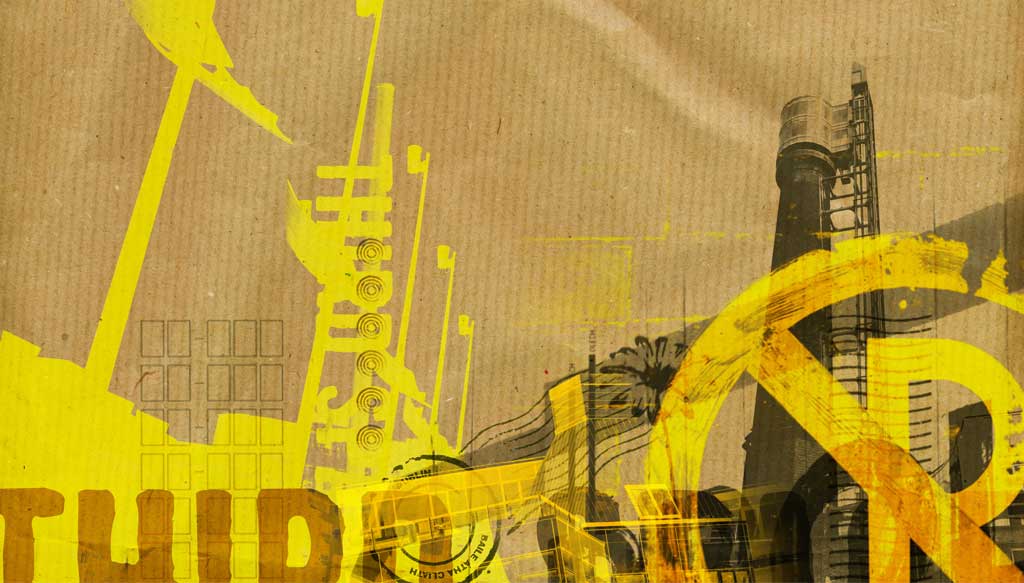
The simplicity of the logo works best when combined with accompanying graphics (below)—a juxtaposition mirroring the fact that Third Space is an escape from the chaos: a fixed point in the constant flux of the city.
The supporting branded materials will incorporate landmarks and scenes from the local area of each Third Space cafe. By using a common aesthetic with details that are unique to each location, Third Space can develop a brand that is coherent, but still allows each venue to remain unique and true to its environment.
Strategy
A couple of key ideas and areas of questioning emerged from the branding process to form central ideas to brand and strategy development: Invitation and User Involvement, Home and Contrast. These developed into some key components for the brands:
Leave your mark
Building on the obvious postmark reference, elements of the Third Space brand have a loose and unfinished nature. An unfinished space creates an invitation to contribute; to leave your mark.
The experience (interiors and branding) will be a blank canvas waiting to be filled with life and lives. As regulars contribute (artwork and artefacts, organise events, etc.) Third Space will become the sort of place where people bring friends and say “look what i did”, or “welcome to my third space – I’ve contributed, I have a part in the physical space and the community itself”.
Third Space can then become a home for its regulars; a place that contains their “stuff”, that they have invested in. A place that is organic and alive – constantly growing and changing.
Well-loved = Worn
The worn aesthetic of Third Space’s branding reflects its desire to develop and grow with the community. A worn object is a loved object; think of a favourite seat or book. Ultimately a worn object/place has a story, and because it is not finished or polished, it invites people to come and be part of that story.
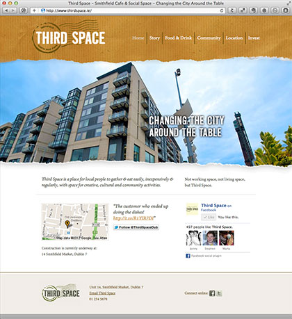
Third Space’s Website
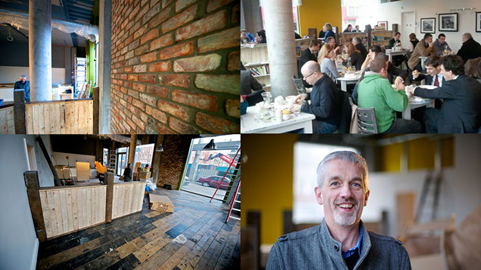
Photos: the first Third Space Cafe under construction, Sean Mullan the founder, and customers during a busy lunch period after the cafe’s recent opening.